
If you want to survive and sustain in the dynamic and competitive digital landscape, you will need to have an online presence for which you will need an interactive website. This will result in higher user engagement, which will, in turn, help in increasing the possibility of converting them into potential customers. Creating an interactive website has become a crucial component in today’s digital landscape.
This means that your website must offer a higher UX or User Experience. It is only then that the users will come back for more. For your information, about 90% of consumers will not visit a website that is less interactive or offers poor UX.
In this blog, we will learn some of the best practices for creating a visually appealing and interactive website.
Key Features of an Interactive Website

1. Chatbots
AI-powered chatbots handle queries 24/7, reduce bounce rates, and keep users engaged outside business hours.
2. Interactive Forms
Multi-step forms with real-time validation and progress bars dramatically improve completion rates over static, single-page alternatives.
3. Animations and Micro-interactions
Purposeful website animations, like scroll-triggered reveals, button feedback, loading transitions, and more, make interfaces feel alive. The keyword is purposeful; they should direct attention, not distract from it.
4. Calculators and Configurators
Pricing calculators or ROI estimators give users immediate, personalized value and position your brand as genuinely helpful.
5. Hover Effects
Subtle hover states on buttons and navigation items communicate interactivity and improve overall website navigation.
6. Dynamic Content
Content blocks that adapt based on user behaviour or location make every visit feel relevant, which is a cornerstone of strong website user experience.
Role of UX/UI in Interactive Website Development
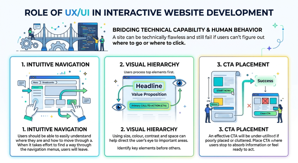
UI UX website development bridges technical capability and human behaviour. A site can be technically flawless and still fail if users can’t figure out where to go or where to click. Here’s how the role of UX/UI works in interactive website development.
1. Intuitive Navigation
Users should be able to easily understand where they are and how to move through a site. When it takes effort to find a way through the navigation menus on a site, users will leave.
2. Visual Hierarchy
Using size, colour, contrast and space can help direct the user’s eye to areas of the page that are most important. In a landing page, the headline, value proposition and the primary call-to-action should all be easily identifiable by the user before they cognitively process the rest of the page content.
3. CTA Placement
An effective CTA will be under-utilised if it is either too far down the page from the content that has driven the user to take action, or is in competition with too many other elements around it. User-friendly design should place the CTA where the user would typically stop to absorb information about the benefit of the product or service, or when they feel they have enough information to act.
The best practices for creating an interactive website design
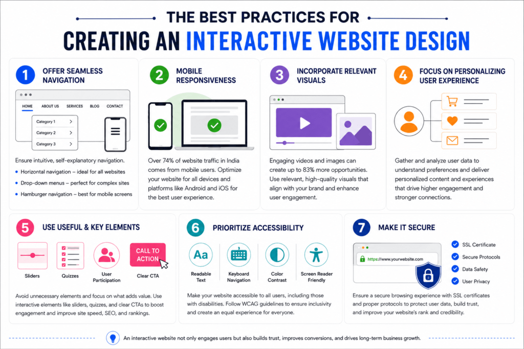
1. Offer Seamless Navigation
You must ensure that the interface of the website is not only intuitive or self-explanatory but also allows seamless navigation. Depending on the type of website there are many types of navigation, like horizontal navigation which is the most common type of navigation placed in the website header section suitable for any type of website, drop-down menu suitable for dynamic websites like e-commerce where there are many categories and sub-categories and Hamburger navigation suitable for mobile screens.
2. Mobile Responsiveness
In today’s digital world, there is nothing that we can’t do on our mobile phones. According to research, it is observed that in India more than 74% of the website traffic comes from mobile users. So it is clear that we can’t ignore the mobile optimisation of the website. Considering the changing preferences of the people Google too has made an algorithm update in 2015. Make sure to optimise the website with different mobile operating systems like Android or IOS.
3. Incorporate Relevant Visuals for Interactive Website Design
Websites with engaging videos or visuals perform well today. Their success rate is quite high, creating about 83% of opportunities. Make sure that the video or the images are relevant and engaging.
Ideally, when you use such visuals, it will make the interface of your website most interactive and immersive. So, make the best use of the multimedia and graphics elements, but ensure that all of them align with the website’s overall aesthetics.
4. Focus on Personalizing User Experience
You must personalize the user experience by incorporating specific elements in your website content that resonate with the users’ preferences.
For this, you will need to gather and analyze a lot of data to understand the users’ preferences and leverage it to personalize and create your website, resulting in higher user interactions and engagements.
5. Use Useful & Key Elements
When you design your website, make sure that you skip all unnecessary elements and incorporate the useful ones. This will not only enhance the user experience but will also make the website faster. Users prefer websites that load faster. So, this will also help in enhancing your SEO and SERP ranking.
Also, make sure that you use elements that will help in interaction. A few common interactive elements are sliders, quizzes, and others that call for audience participation. Do not forget to include a clear and compelling Call to Action in your website design.
6. Prioritize Accessibility
A website that is easily accessible is more successful. For this, you will need to follow the SEO best practices.
In addition, you will be better off if you focus on incorporating interactive elements into your website design that will offer easy accessibility to the website, even for users with specific disabilities.
To enhance and ensure inclusivity, make sure you follow the WCAG guidelines.
7. Make it Secure
Security of the website is an important aspect that affects both the website’s rank and the footfall. So, focus on a secure browser and valid SSL certifications, and incorporate all protocols to ensure consumer data safety and privacy.
Fever Other Tips
- Keep some time for your content strategies. Depending on your website, interactive content and relevant content are bait to grab readers’ attention.
- Have social sharing buttons so the content and website are shared with the world.
- Write blog posts regularly to keep the readers engaged.
- Try to reduce the bounce rate by scrutinizing the interactive elements, navigation menus, and visual effects.
- Your website should have a responsive design for an engaging experience for the readers both on desktop and mobile.
Importance of Mobile Responsiveness
With Google’s mobile-first indexing as the default standard, how your site performs on a smartphone is how it’s evaluated for search rankings. Responsive web design is the foundation of any credible website development strategy.
Responsive web design layouts use fluid grids, flexible images, and CSS media queries to ensure your site adapts to any screen size. Mobile-first design takes this further by designing for the smallest screen first, forcing clarity and resulting in leaner, faster experiences across all devices.
Touch-friendly design is equally critical. Buttons must be large enough to tap accurately, form fields need to accommodate on-screen keyboards, and swipe gestures should feel natural. Website responsiveness is as much about feel as it is about layout.
Why Interactive Websites Matter for Businesses
In today’s digital-first world, interactive website design development is a competitive necessity. Businesses that invest in interactive website design see measurable gains across three critical areas:
- User engagement
- Conversion rates
- Customer retention
When visitors land on a static page, they consume and leave. But when a website responds to them, through dynamic content, personalized suggestions, or real-time feedback, it creates a two-way experience that holds attention longer and signals value to search engines.
From a conversion standpoint, interactive web elements guide users through the decision-making journey. And when users consistently find an experience intuitive and satisfying, they come back. This makes interactivity one of the strongest long-term drivers of customer retention.
Website Speed Optimization Best Practices
1. Image Compression
Using modern formats like WebP or AVIF can cut file sizes by 50% to 80% without visible quality loss.
2. Lazy Loading
Deferring off-screen assets until the user scrolls towards them reduces initial page weight and improves perceived speed.
3. Caching
Browser and server-side caching ensures repeat visitors load pages almost instantly, and first-time visitors aren’t kept waiting.
4. Core Web Vitals
Metrics like LCP, INP, and CLS give a measurable framework for performance. Regular audits via Google Search Console or Lighthouse identify the fixes with the highest SEO and usability impact.
Accessibility Best Practices for Websites
An accessible website works for everyone, including people who use screen readers, navigate by keyboard, and have difficulty distinguishing certain colours. It makes your site easier to find by search engines.
1. Alt Text
Adding a short description to every meaningful image means people using screen readers still understand what’s on the page.
2. Colour Contrast
Text that’s hard to read becomes a barrier. Making sure there’s enough contrast between your text and background ensures everyone can read your content comfortably.
3. Keyboard Navigation
Let’s say some users can’t use a mouse at all. Every button, link, and form on your site should work perfectly when navigating with just a keyboard. This also includes a proper cursor that shows where you are on the screen.
4. ADA & WCAG Compliances
Staying compliant with ADA and WCAG regulations means regularly checking your website with accessibility tools and doing real-world testing. It protects you legally, but more importantly, it means no one is silently excluded from using your website.
Tools & Technologies Used for Interactive Websites
Behind every smooth, engaging website design is a set of tools and technologies doing the heavy lifting. You don’t need to be a developer to appreciate what they make possible.
- React: React is the building block most modern interactive websites are built with. It lets developers create components (buttons, menus, forms) that update instantly without refreshing the whole page. That’s what makes apps feel fast and fluid.
- JavaScript: JavaScript is the engine. It’s the language that makes things actually do something, like responding to clicks, validating forms, loading new content on the fly. Virtually all interactive web elements run on it.
- Animation Libraries: Tools like GSAP and Framer Motion give developers a simpler way to build smooth, polished animations without writing everything from scratch. The result is a more consistent, professional feel.
- CMS Platforms: A CMS (Content Management System), like WordPress, Webflow, or Contentful, is what lets your marketing team update the website without calling a developer every time. Choosing the right one from the start means your site can grow and change with your business, without turning every small update into a big project.
Common Mistakes to Avoid in Interactive Web Design
Even well-intentioned websites can end up frustrating the people they’re trying to help. Here are the common mistakes to avoid in interactive web design.
1. Excessive Animations
A little movement goes a long way. When everything is fading, bouncing, or sliding, the page starts to feel chaotic. Heavy animations can also slow things down. If an animation isn’t making the experience clearer or more enjoyable, it probably doesn’t need to be there.
2. Poor Navigation
If someone has to hunt for your contact page, that’s a problem. Poor navigation is often invisible to the people who built the interactive website design, but it can be immediately obvious to everyone else. Regular user testing goes a long way here.
3. Slow Loading Speed
People are patient in real life, but on the internet, not so much. A slow website sends a subtle message that something’s not right. Most visitors won’t stick around long enough to give you the benefit of the doubt.
4. Cluttered Layouts
Trying to say everything at once usually means nothing lands. When a page is packed with text, banners, popups, and competing buttons, visitors don’t know where to look. Giving your content space to breathe is good interactive website development practice.
Conclusion
In conclusion, you must follow the best practices to create an interactive website development. It is essential because it will help you keep up with the ever-changing landscape and website responsive design requirements.
The responsive design of your website will determine its functionality and intuitiveness. Most importantly, it must be user-friendly. To ensure that, you must focus beyond the aesthetics of the website.
You must be innovative, consider user feedback, and ensure that the web design reflects your brand most dynamically. This will ensure the success of your website with a higher conversion rate.

Pradeep Jade is a seasoned digital marketing consultant with over 20 years of experience across the market. He has helped businesses unlock sustainable growth in an ever-changing digital sphere. He is known for blending strategic insight with cutting-edge tools and technologies. He uses his vast experience to design result-driven marketing solutions that accelerate brand visibility, lead generation, and revenue growth. Book a free consultation with him to explore how you can take your business from 2X to 10X.